
 Upgrade Storage
Request for compact view in dropdown menus
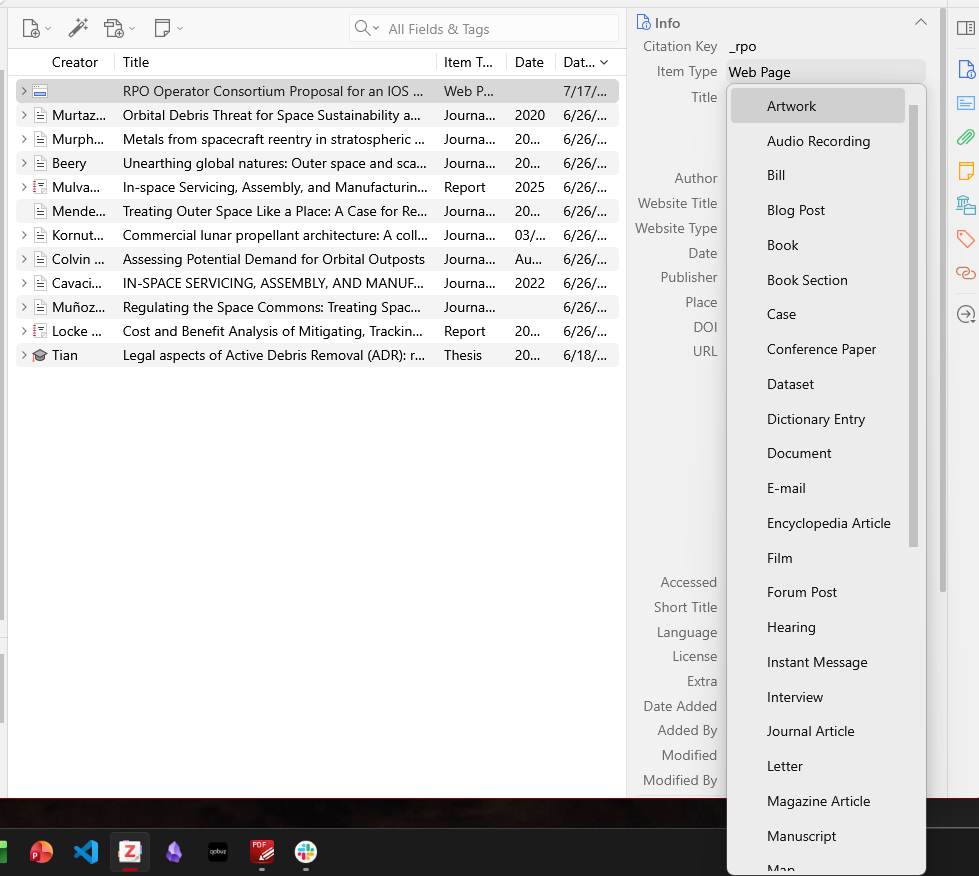
Windows version has menus that still expand as if I'm using a touch display, despite my font size being small and "compact" density. It would be nice to have the dropdown menu follow these rules and not extend outside the window.
Workflow is faster if I can see most, if not all, options for Item Type at once and select immediately without having to scroll when comparing options or looking for the most accurate.
https://s3.amazonaws.com/zotero.org/images/forums/u10211737/kd3597oc5pox5xodw88a.png
Workflow is faster if I can see most, if not all, options for Item Type at once and select immediately without having to scroll when comparing options or looking for the most accurate.
https://s3.amazonaws.com/zotero.org/images/forums/u10211737/kd3597oc5pox5xodw88a.png
For me, it's particularly uncomfortable when the “fields” and “collections” lists are displayed. It would be great if those drop-down menus could be made a little more compact. Thanks!