 Upgrade Storage
3 UX inconsistencies after using zotero for a few days
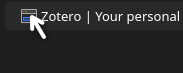
1. Icons at the start of the line should show Item Type as alt text on hover, the ones at the end of the line (attachments) already do this
https://s3.amazonaws.com/zotero.org/images/forums/u21347227/es56ug5rqlwf2sgggk0k.png
2.A. In the tabs bar theres weird empty space in front of the first tab. This isnt helped by the fact that the default width of the left pane appears to be the same width as a tab and therefore the tab appears to be protruding out. I'd expect this space in the front of the first tab to be the same size as the spaces between individual tabs.
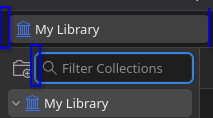
2.B. There appears to be missing padding at the right side of the New Collection icon which becomes apparent upon clicking on the Filter Collection icon
https://s3.amazonaws.com/zotero.org/images/forums/u21347227/99u6919h3uxwcq4vy1l1.png
3.A. I use Linux and there is a convention that even if app is using rounded corners, upon maximisation they will disappear signifying that the window is in fact maximised as
1) a lot of apps/windows like to start up already taking all available window space yet not technically maximised
2) unlike in Windows a lot of apps under Linux use the same window control icon for both Maximise and Restore and therefore the icon is not a good source of truth regarding status of window maximisation
and 3) it just looks weird to have rounded corners when maximised
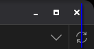
3.B. when maximised I'd also expect for the window control icons to get realigned, such that the window close icon would be above the Sync With Zotero icon for e.g., the menu bar on the left side (not shown) would also get realigned.
https://s3.amazonaws.com/zotero.org/images/forums/u21347227/20zcjv1tljewep9hxgpb.png
https://s3.amazonaws.com/zotero.org/images/forums/u21347227/es56ug5rqlwf2sgggk0k.png
2.A. In the tabs bar theres weird empty space in front of the first tab. This isnt helped by the fact that the default width of the left pane appears to be the same width as a tab and therefore the tab appears to be protruding out. I'd expect this space in the front of the first tab to be the same size as the spaces between individual tabs.
2.B. There appears to be missing padding at the right side of the New Collection icon which becomes apparent upon clicking on the Filter Collection icon
https://s3.amazonaws.com/zotero.org/images/forums/u21347227/99u6919h3uxwcq4vy1l1.png
3.A. I use Linux and there is a convention that even if app is using rounded corners, upon maximisation they will disappear signifying that the window is in fact maximised as
1) a lot of apps/windows like to start up already taking all available window space yet not technically maximised
2) unlike in Windows a lot of apps under Linux use the same window control icon for both Maximise and Restore and therefore the icon is not a good source of truth regarding status of window maximisation
and 3) it just looks weird to have rounded corners when maximised
3.B. when maximised I'd also expect for the window control icons to get realigned, such that the window close icon would be above the Sync With Zotero icon for e.g., the menu bar on the left side (not shown) would also get realigned.
https://s3.amazonaws.com/zotero.org/images/forums/u21347227/20zcjv1tljewep9hxgpb.png