
 Upgrade Storage
UI suggestion: streamline the highlight color/style popup in the PDF reader
Current behavior
https://s3.amazonaws.com/zotero.org/images/forums/u6115020/tk6d0hag2vgq4pkh0o00.png
When you select text, the popup menu shows a row of 8 color swatches, and below that a separate row with two style toggles: highlight and underlined.
The problem
I regularly switch between underline and regular highlight depending on context, and I find it a bit fiddly to apply the right combination of color + style — color and style live in two separate rows, so it's easy to pick the right color but leave the style toggle on whatever it was set to before (or vice versa). To be clear, this is still noticeably smoother than most other PDF readers I've used — kudos to the team — but I think it could be even better.
I mocked up three possible redesigns of the popup to fix this. All three try to make color and style a single decision instead of two. (PS: I'm not a UI designer, so I'm sure I'm breaking a few design principles in these mockups — take them as a starting point for the idea, not a finished proposal.)
Alt 1: Two full rows, one per style, solid color icons
https://s3.amazonaws.com/zotero.org/images/forums/u6115020/kgnhw0q1bqzs3jwnqgkv.png
The single color row is split into two rows of 8 colored buttons each (same 8 colors, same order in both rows):
Alt 2: Same two-row layout, lighter icon style
https://s3.amazonaws.com/zotero.org/images/forums/u6115020/20id4my38b75ffysnywr.png
Structurally identical to Alt 1 (8 colors × 2 style rows), but the buttons are visually lighter: instead of solid color fill, each swatch is a white/transparent button with a colored outline and a colored "A" icon (boxed for highlight, underlined for underline). Same one-click color+style selection as Alt 1, but less visually heavy/saturated — closer in weight to the current menu's style toggles.
Alt 3: Same two rows, plain swatches with one label icon per row
https://s3.amazonaws.com/zotero.org/images/forums/u6115020/agu7pwe0go9ie00i5vkg.png
Same structure and functionality as Alt 1/Alt 2: a highlight row and an underline row, 8 colors each, clicking a swatch applies that color in that row's style. The difference is purely visual — the swatches themselves are plain solid color squares with no icon inside, and each row instead has a single leading label icon (boxed "A" for the highlight row, underlined "A" for the underline row) showing what that row does. So it's not more compact than Alt 1/Alt 2 (still 8+8 buttons) — if anything it's slightly wider because of the leading label icon — just a different visual treatment.
My take: all three solve the "wrong combination" problem the same way functionally; Alt 1 and Alt 2 mainly differ in how heavy/saturated the buttons look, and Alt 3 trades a repeated icon per swatch for one label per row. Curious what the team and other users think — happy to iterate on the mockups if there's interest.
https://s3.amazonaws.com/zotero.org/images/forums/u6115020/tk6d0hag2vgq4pkh0o00.png
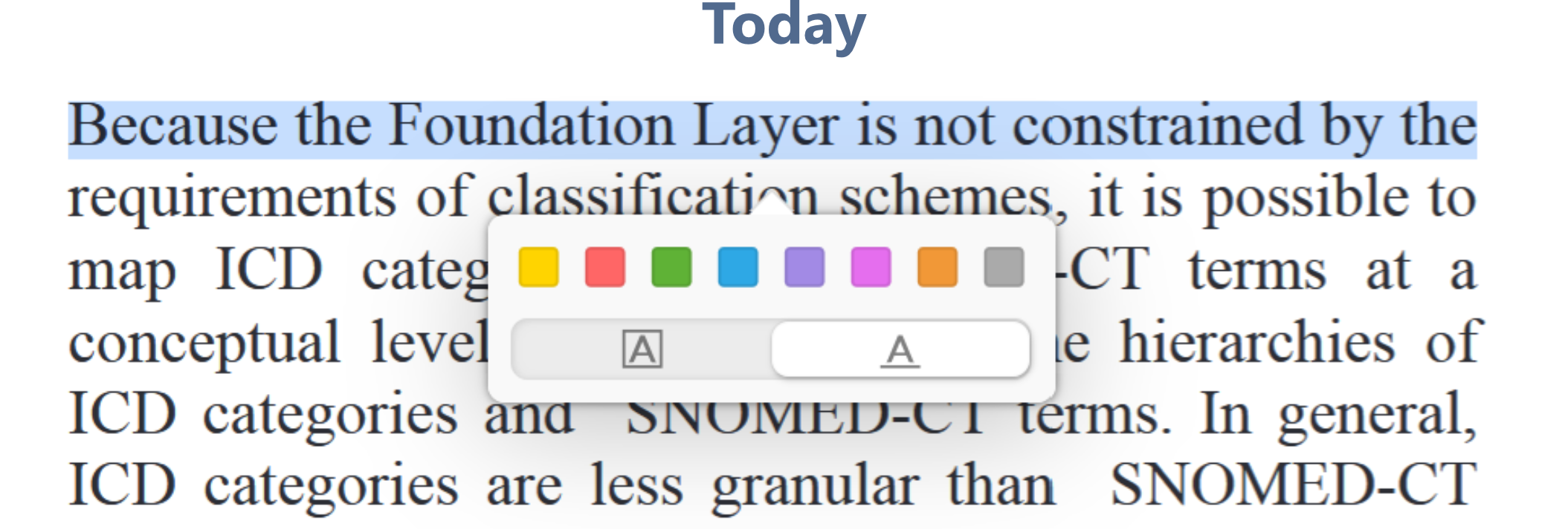
When you select text, the popup menu shows a row of 8 color swatches, and below that a separate row with two style toggles: highlight and underlined.
The problem
I regularly switch between underline and regular highlight depending on context, and I find it a bit fiddly to apply the right combination of color + style — color and style live in two separate rows, so it's easy to pick the right color but leave the style toggle on whatever it was set to before (or vice versa). To be clear, this is still noticeably smoother than most other PDF readers I've used — kudos to the team — but I think it could be even better.
I mocked up three possible redesigns of the popup to fix this. All three try to make color and style a single decision instead of two. (PS: I'm not a UI designer, so I'm sure I'm breaking a few design principles in these mockups — take them as a starting point for the idea, not a finished proposal.)
Alt 1: Two full rows, one per style, solid color icons
https://s3.amazonaws.com/zotero.org/images/forums/u6115020/kgnhw0q1bqzs3jwnqgkv.png
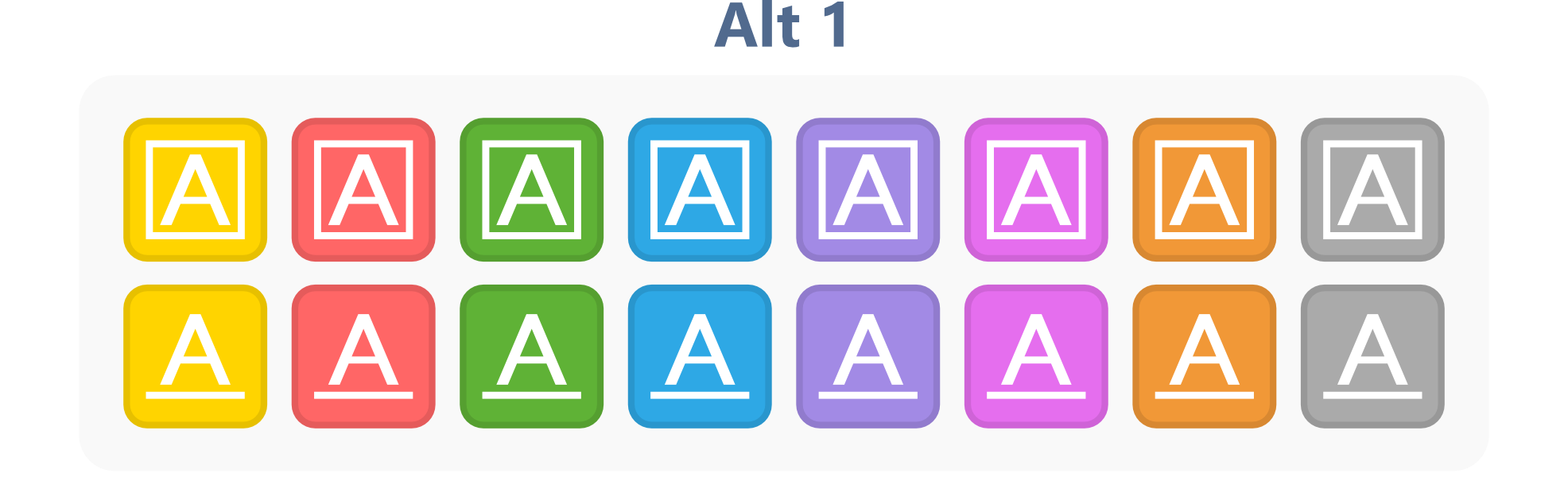
The single color row is split into two rows of 8 colored buttons each (same 8 colors, same order in both rows):
- Top row: each swatch is a solid color square containing a white boxed "A" icon → applies that color as a highlight.
- Bottom row: each swatch is a solid color square containing a white underlined "A" icon → applies that color as an underline.
Alt 2: Same two-row layout, lighter icon style
https://s3.amazonaws.com/zotero.org/images/forums/u6115020/20id4my38b75ffysnywr.png
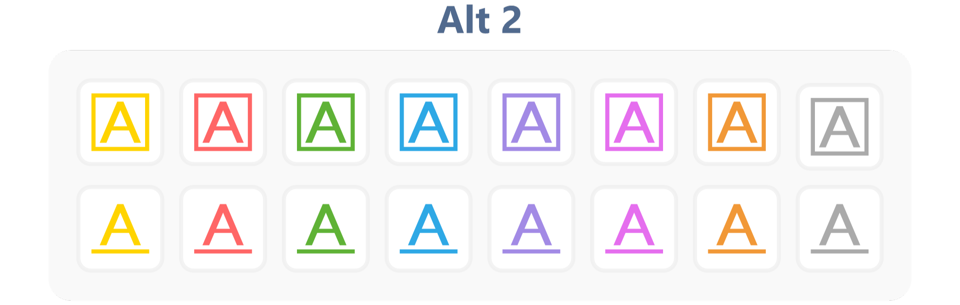
Structurally identical to Alt 1 (8 colors × 2 style rows), but the buttons are visually lighter: instead of solid color fill, each swatch is a white/transparent button with a colored outline and a colored "A" icon (boxed for highlight, underlined for underline). Same one-click color+style selection as Alt 1, but less visually heavy/saturated — closer in weight to the current menu's style toggles.
Alt 3: Same two rows, plain swatches with one label icon per row
https://s3.amazonaws.com/zotero.org/images/forums/u6115020/agu7pwe0go9ie00i5vkg.png
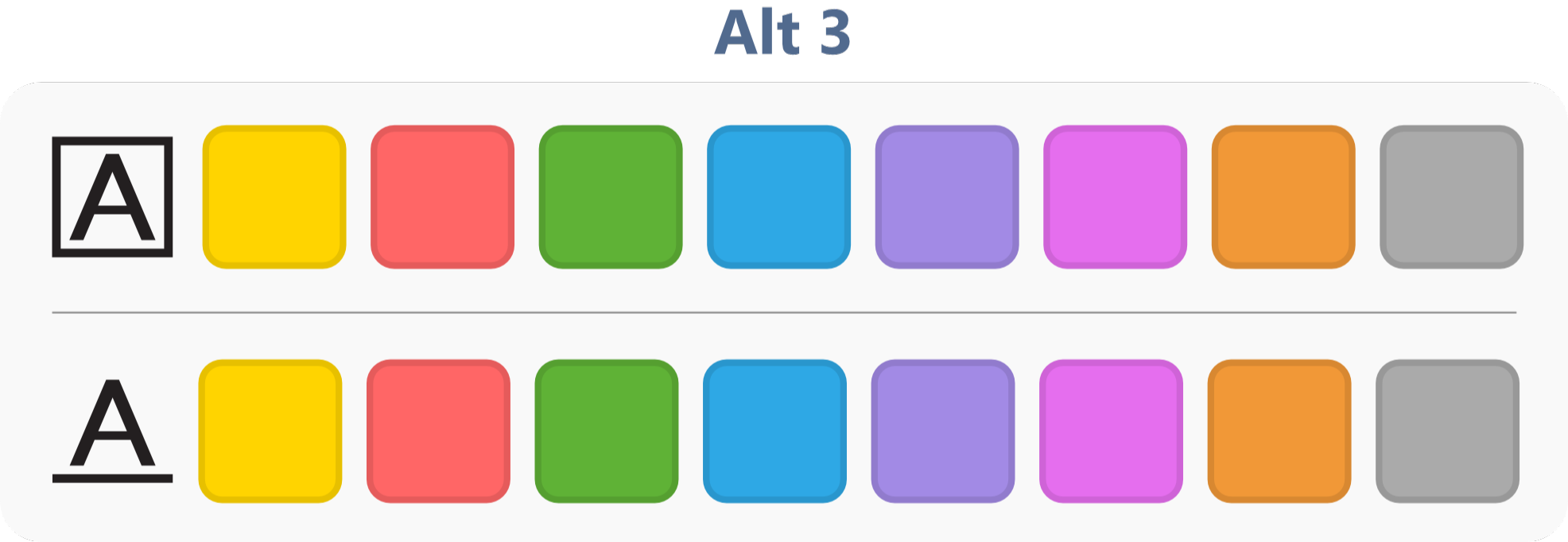
Same structure and functionality as Alt 1/Alt 2: a highlight row and an underline row, 8 colors each, clicking a swatch applies that color in that row's style. The difference is purely visual — the swatches themselves are plain solid color squares with no icon inside, and each row instead has a single leading label icon (boxed "A" for the highlight row, underlined "A" for the underline row) showing what that row does. So it's not more compact than Alt 1/Alt 2 (still 8+8 buttons) — if anything it's slightly wider because of the leading label icon — just a different visual treatment.
My take: all three solve the "wrong combination" problem the same way functionally; Alt 1 and Alt 2 mainly differ in how heavy/saturated the buttons look, and Alt 3 trades a repeated icon per swatch for one label per row. Curious what the team and other users think — happy to iterate on the mockups if there's interest.
Short addition to my own post: I got curious about how this would actually feel in practice rather than just look in a mockup, so I spent some time this morning cobbling together a small plugin that implements all three alternatives.
GitHub Reop
It turns the colour row + style toggle into two rows of eight colours — top row highlights, bottom row underlines — so colour and style are a single click. All three layouts from the mockups above are included and switchable in the preferences, plus a larger "tablet" button size for touch use.
https://s3.amazonaws.com/zotero.org/images/forums/u6115020/oq7tm8js7gbdtbslbpg3.png
A few honest caveats, because I don't want to oversell this:
Mainly I'm posting it because using it for a bit is more informative than staring at mockups, and it might be more useful to the discussion to have something people can actually try. Curious whether it feels better or worse in practice than it looks.
And if anyone reading this actually knows Zotero plugin development and wants to take it over or rebuild it properly, please do — just let me know so I can switch to your version.