 Upgrade Storage
Option to use standard title bar on macOS
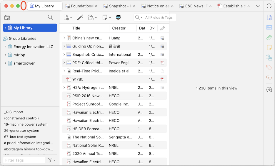
On macOS (and maybe other operating systems), tab labels for the active library and recently opened previews all appear right at the top of the main Zotero window, in the space where a title menu traditionally appeared. Because of this, once a few previews are open, the only place you can click to move the window around is the small open section of the "title bar" between the red/yellow/green window controls and the first tab (see red oval in attached screen shot).
This is an unusually small area, and may require more mouse movement than other windows. This can make it annoying to rearrange Zotero to be in a good position relative to other open windows.
Chrome uses a similar approach, but keeps a bigger click target open to the right of all the tabs, so users can at least click at either end of the window. Other apps show a title bar above the tabs, which is a nice, big click target. VS Code has a user preference for Window > Title Bar Style > native, which creates a traditional title bar.
Would it be possible to add a preference pane option to have a traditional title bar on this window, or else add some open space to the right of the tabs, so there are drag targets on both ends of this window?
https://s3.amazonaws.com/zotero.org/images/forums/u1686015/n5rxxkjhz0o4wah49zyk.png
https://s3.amazonaws.com/zotero.org/images/forums/u1686015/hscl2t58dqmzbhlmdkq9.png
1) This is a standard feature of macOS toolbars. macOS has largely removed standard title bars in favor of draggable toolbars (Finder, Safari, Calendar, Photos, Preview, Notes, etc.). Apps that still have traditional title bars (Pages, TextEdit) are the exception at this point.
2) You seem to have made your window very narrow in this screenshot. I don't know if that was just for effect or you're purposely using Zotero at a fraction of your screen width, but at a more reasonable width on a standard Mac laptop display, you'd have much more space in the middle section (where you also have a plugin button taking up space). This is Zotero at not even close to full width on a 14" MBP, with a huge draggable area in the middle toolbar:
https://s3.amazonaws.com/zotero.org/images/forums/u6/qj32if6dl2iq39j6xpao.png
3) Even in your own artificially narrow screenshot, you've circled an area ~120px across, which is twice the space Chrome gives you to the right of the tabs.
We're not going to be changing this, sorry.