 Upgrade Storage
Item selection color in Zotero 7 Beta Redesign
I have some feedback critiques on the coloring used for item selection:
The icons (item type, and attachment type like PDF or snapshot) are hard to interpret when an item is selected: the "select color" is blue, which is fine, but the icon colors are removed and the style is switched to outline--removing the colors reduces the recognition, and it's maybe possible the outline is also detracting.
This is exacerbated when scanning a library or collection to compare these attributes (item type and attachment type), since the visual indicator is so drastically different from the selected and unselected items.
For example:
https://s3.amazonaws.com/zotero.org/images/forums/u203106/529707dovvyog0h9sr7g.png
It's not clear that the top selected item does not have a PDF, or that the bottom selected item is a pre-print, unless you look extra hard and consciously think about the white outlines.
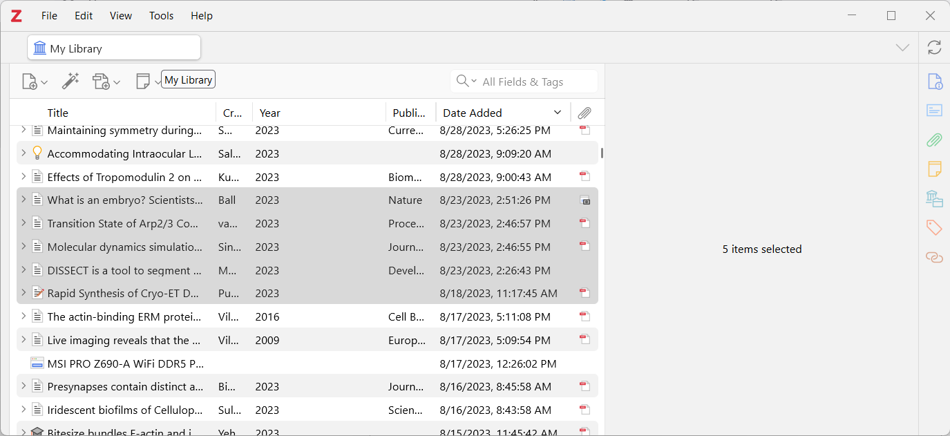
Interestingly, if I click on the My Library tab, the selection color becomes gray and moves to the background, leaving the icon colors, making it much easier to interpret:
https://s3.amazonaws.com/zotero.org/images/forums/u203106/b1cqth83chcsv9bbn1oi.png
I'm using Windows 7.0.0-beta.56+9edfcba9a
(I'll also note that the beta is shaping up really nicely, thanks!)
The icons (item type, and attachment type like PDF or snapshot) are hard to interpret when an item is selected: the "select color" is blue, which is fine, but the icon colors are removed and the style is switched to outline--removing the colors reduces the recognition, and it's maybe possible the outline is also detracting.
This is exacerbated when scanning a library or collection to compare these attributes (item type and attachment type), since the visual indicator is so drastically different from the selected and unselected items.
For example:
https://s3.amazonaws.com/zotero.org/images/forums/u203106/529707dovvyog0h9sr7g.png
It's not clear that the top selected item does not have a PDF, or that the bottom selected item is a pre-print, unless you look extra hard and consciously think about the white outlines.
Interestingly, if I click on the My Library tab, the selection color becomes gray and moves to the background, leaving the icon colors, making it much easier to interpret:
https://s3.amazonaws.com/zotero.org/images/forums/u203106/b1cqth83chcsv9bbn1oi.png
I'm using Windows 7.0.0-beta.56+9edfcba9a
(I'll also note that the beta is shaping up really nicely, thanks!)