 Upgrade Storage
Suggested change to the new citation dialog box
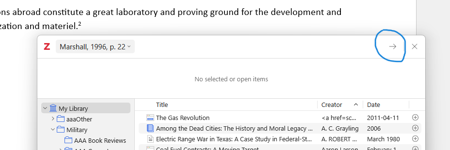
To complete the citation process the user must click on an arrow (screenshot attached). My suggestion is to either make the arrow more prominent or, even better, replace it with a "Finish" button. This is obviously far from a critical item, but it would be nice to have.
https://s3.amazonaws.com/zotero.org/images/forums/u993/tw1g9xdx96uv6wn9y7cg.png
https://s3.amazonaws.com/zotero.org/images/forums/u993/tw1g9xdx96uv6wn9y7cg.png
-
adamsmithYou realize you can just hit return?
-
stankaplSadly no. Nonetheless, for people getting use to this new approach to citations (such as me) I think my suggested change would be helpful.
-
adamsmithI think the (reasonable, imo) design philosophy here is that in dialogs that you rarely use, you make the OK/Accept/Proceed etc. button prominent. But a dialog that users will typically use dozens, many hundreds or thousands of time, having them repeatedly stare at a giant prominent button or "Finish" text isn't actually good UI. Even if it takes you 10secs more to find this on the first try, having the UI focus on the changing elements that the user actually needs to think about interacting with makes sense -- same UI consideration e.g. for chat apps, be it Slack/Discord or AI chat interfaces. All of those have small inconspicuous buttons on the margins of the interface and almost certainly expect users to rely on their keyboard 9/10 times.
-
stankaplYour argument is compelling. Thanks.
-
stankaplAfter a lot more experience with the new citation dialog box I still think making the arrow more prominent -- thicker line or darker color -- would be helpful. As is, it almost fades into the background.