 Upgrade Storage
Tiny Create Creator button difficult to recognize
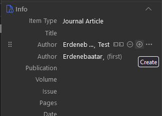
The new "+" button to add a new creator is difficult to distinguish:
https://s3.amazonaws.com/zotero.org/images/forums/u265723/flnrb13z6y27q9mc8ji5.png
Expanded:
https://s3.amazonaws.com/zotero.org/images/forums/u265723/5t9ttt8hnieqivi1ricu.png
All the pixels on the "+" or "-" have a lighter gray, which makes it difficult to recognize.
It was clear in earlier version:
https://s3.amazonaws.com/zotero.org/images/forums/u265723/6ym2oykzthwwrdpujmk5.png
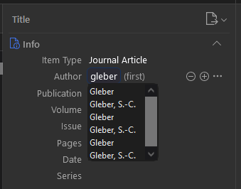
Image from: https://forums.zotero.org/discussion/112256/zotero-7-beta-duplicates-of-auto-completion-suggestions-of-an-author
I would prefer keeping the earlier design without the button to "Switch to Single Field", as I nearly never use it.
Zotero 7.0.0-beta.117+794dc6bf0 (64-bit)
Windows 10
Screen resolution: 1920 x 1080
https://s3.amazonaws.com/zotero.org/images/forums/u265723/flnrb13z6y27q9mc8ji5.png
Expanded:
https://s3.amazonaws.com/zotero.org/images/forums/u265723/5t9ttt8hnieqivi1ricu.png
All the pixels on the "+" or "-" have a lighter gray, which makes it difficult to recognize.
It was clear in earlier version:
https://s3.amazonaws.com/zotero.org/images/forums/u265723/6ym2oykzthwwrdpujmk5.png
Image from: https://forums.zotero.org/discussion/112256/zotero-7-beta-duplicates-of-auto-completion-suggestions-of-an-author
I would prefer keeping the earlier design without the button to "Switch to Single Field", as I nearly never use it.
Zotero 7.0.0-beta.117+794dc6bf0 (64-bit)
Windows 10
Screen resolution: 1920 x 1080
The -/+ icons look good now.