
 Upgrade Storage
iOS items list
Hello,
Very happy that Zotero has grown as it has to a very nice app.
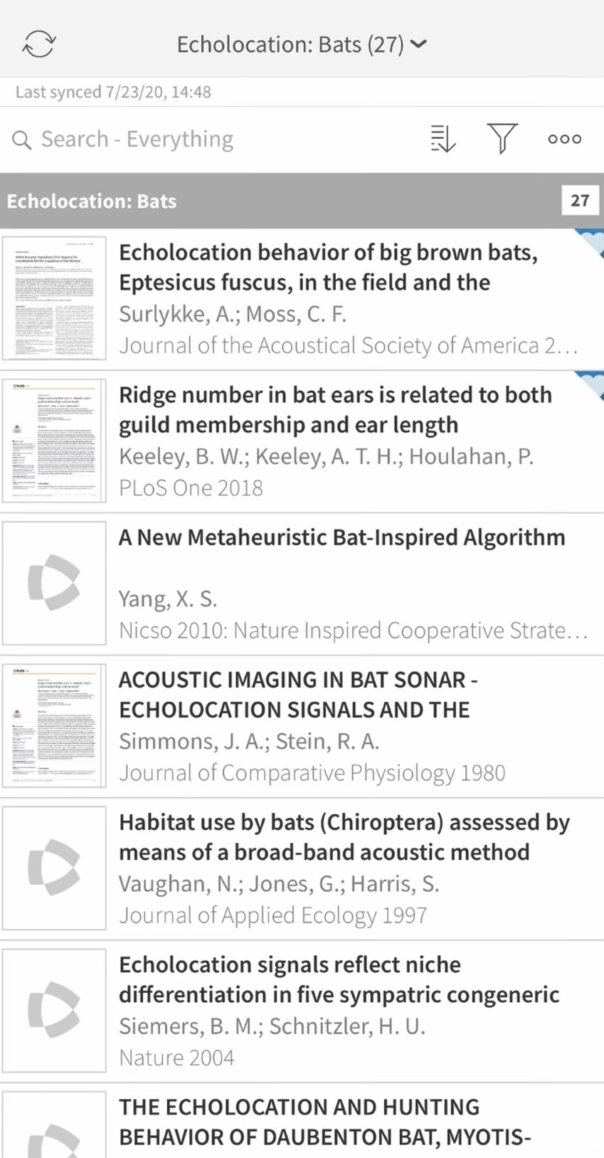
I've started using the iOS app and I have one suggestion. Article titles can be quite long such that with the current one line for item title I think makes it hard to know what an article is about. Maybe such could be expanded to two lines? I think the journal name might also help. Attached is a screenshot from another app:
https://s3.amazonaws.com/zotero.org/images/forums/u23633/0nqn8hbzrjlqc1j4nv3i.jpg
Maybe moving the PDF or file type icon to integrate it into the left thumbnail might also create more space. The info button undecided if it helps; perhaps moving to the tap and hold context menu is an option.
The font size for authors I think also could be smaller similar to how Mail shows the sender in the default size and secondary text in a smaller size.
Overall, if one's library grows to hundreds or thousands of items, I think such might greatly improve usability.
Very happy that Zotero has grown as it has to a very nice app.
I've started using the iOS app and I have one suggestion. Article titles can be quite long such that with the current one line for item title I think makes it hard to know what an article is about. Maybe such could be expanded to two lines? I think the journal name might also help. Attached is a screenshot from another app:
https://s3.amazonaws.com/zotero.org/images/forums/u23633/0nqn8hbzrjlqc1j4nv3i.jpg
Maybe moving the PDF or file type icon to integrate it into the left thumbnail might also create more space. The info button undecided if it helps; perhaps moving to the tap and hold context menu is an option.
The font size for authors I think also could be smaller similar to how Mail shows the sender in the default size and secondary text in a smaller size.
Overall, if one's library grows to hundreds or thousands of items, I think such might greatly improve usability.