 Upgrade Storage
Collection title displaying is poor [duplicate of discussion 127097]
I mean, see screenshot below:
https://s3.amazonaws.com/zotero.org/images/forums/u6735168/61f3po9vbalwxd32f4ue.png
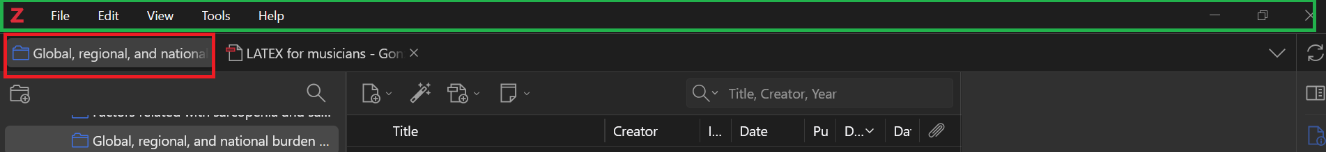
In Zotero 8, the selected collection name as current view of the Zotero window is displayed in the tab top for the item+collection panes (red rectangle), so a very short part can be read. I believe before (let's say Zotero 6), that title was displayed either on the menu (?) bar (green rectangle) or above it, therefore it could be seen longer than it can be seen now.
https://s3.amazonaws.com/zotero.org/images/forums/u6735168/61f3po9vbalwxd32f4ue.png
In Zotero 8, the selected collection name as current view of the Zotero window is displayed in the tab top for the item+collection panes (red rectangle), so a very short part can be read. I believe before (let's say Zotero 6), that title was displayed either on the menu (?) bar (green rectangle) or above it, therefore it could be seen longer than it can be seen now.
This discussion has been closed.
https://s3.amazonaws.com/zotero.org/images/forums/u6735168/q56w67sp94ybpeyi8utl.png